The Minimum Viable Author Platform

The Minimum Viable Author Platform

Busy Women’s Guide to Selling a First Non-fiction Book Without Burning Out

A first book does not just need a great manuscript; it needs a simple, sturdy platform that helps real readers find it and care about it. For mid‑career women writing nonfiction, a “minimum viable” author platform can be enough to launch a debut book without burning out.

What “Author Platform” Really Means

Author platform is the total of your visibility, credibility, and connection with the people your book is for.
It is not about becoming internet‑famous; it is about being findable and trustworthy to your specific readers.

For a first‑time nonfiction author, platform should support three goals: validate your expertise, give readers a way to stay in touch, and gently guide people toward buying the book or working with you.

Start With a Clear Reader and Promise

Before building anything, define who your reader is and what your book promises.

  • Who she is: job, life stage, and what she is struggling with right now.

  • What she wants: the concrete outcome she hopes your book will help her reach.

  • Your promise: one sentence that explains how your book gets her from “before” to “after.”

This clarity becomes the thread you repeat across your site, email list, and social channels so everything feels coherent and intentional.

The Minimum Viable Platform

Instead of trying to be everywhere, build three core pieces:

  • A simple author website (or a strong book page on an existing site).

  • An email list with one clear opt‑in.

  • One primary outreach channel where you show up consistently.

Everything else is optional. This is what can reasonably fit alongside a demanding career and a first book.

Part 1: Your Simple Author Website
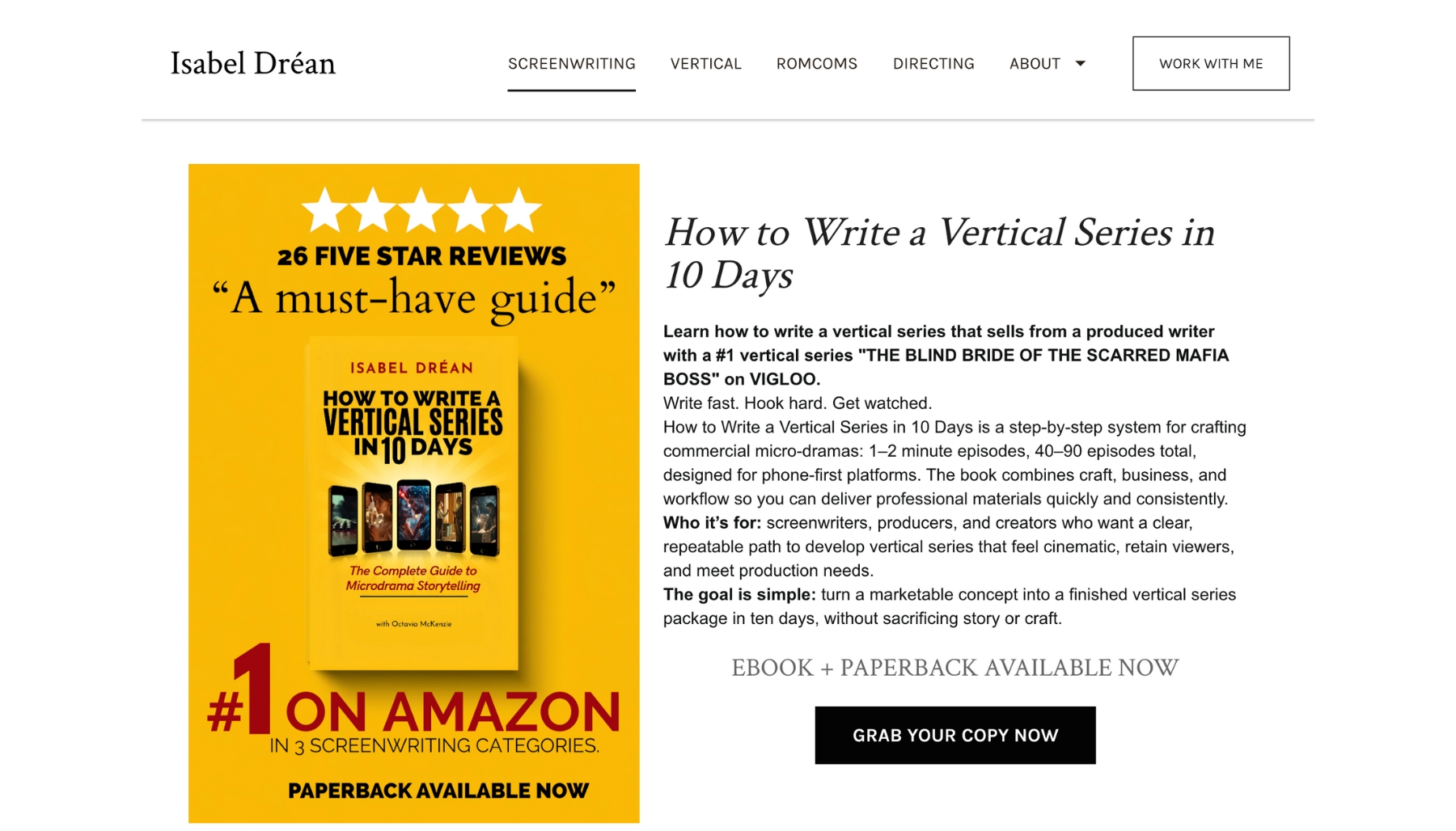
Home page of Isabel Drean's website showing a photo of her recent release and a description of the book

Your site is home base: the one link you can put on your book, your social profiles, business cards, and podcast bios.

The pages you actually need

For a first book, four pages are usually enough:

Home

    • Speak directly to your reader and her problem.

    • One clear headline (“Helping mid‑career women turn burnout into a sustainable career plan”), a short intro, and a call to join your email list.

Book (or Books)

  • Title, subtitle, book cover, and a strong, benefit‑focused description.

  • Links to buy on Amazon (and anywhere else) plus a short “Who this book is for” section.

  • Optional: endorsements, early reviews, or a brief table of contents preview.

About

    • A focused bio that ties your experience directly to the promise of the book.

    • One paragraph personal, one paragraph professional, one paragraph showing why you care about this reader.

Contact / Work With Me (if relevant)

    • A basic contact form or email.

    • If your book connects to services (coaching, consulting, speaking), one short section explaining how the book fits into that offer.

Design that supports your first book
  • Keep it clean and mobile‑friendly; most readers will visit from their phones.

  • Use your book cover colors as your main palette so everything feels cohesive.

  • Include a clear “Get the first chapter free” or similar opt‑in on every page.

The goal is not a perfect website; the goal is a professional home that makes it easy for someone to understand who you are, what your book does, and what to do next.

Part 2: Your Email List and Lead Magnet
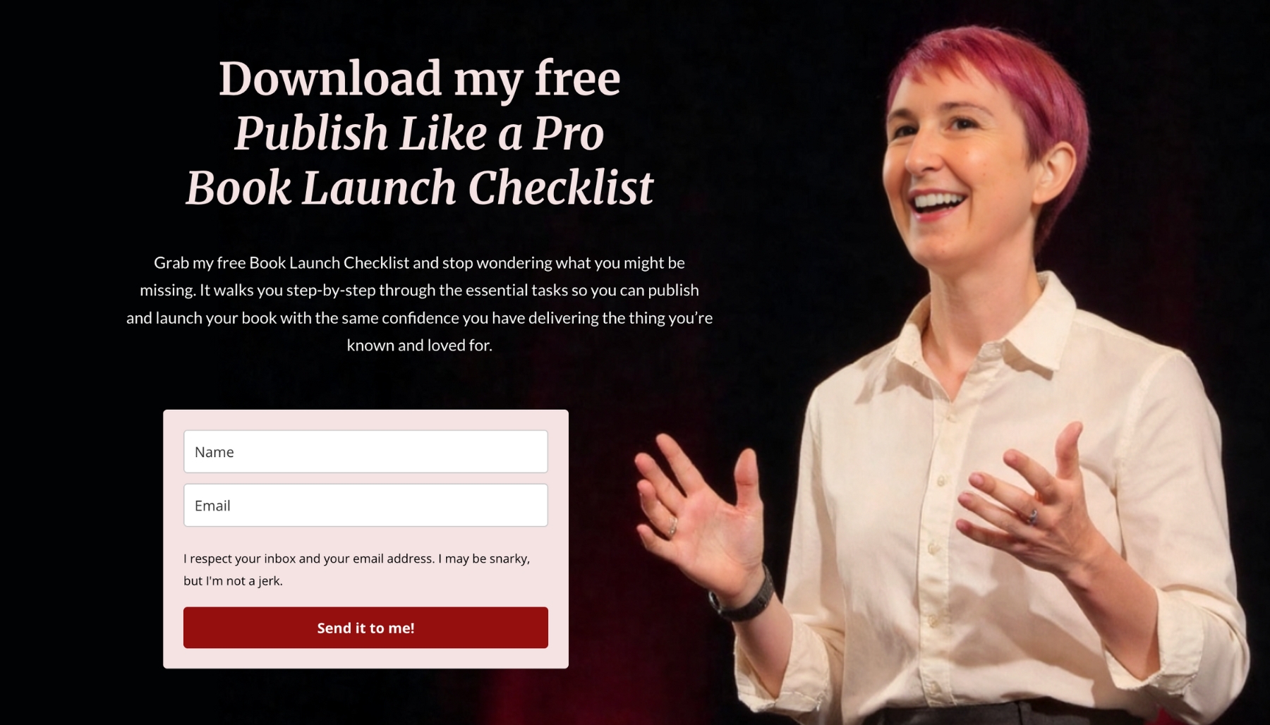
Donna standing with arms in invitation and the sign-up to download her lead magnet

Social platforms come and go; your email list is the one asset you actually own.


Why email matters for a first‑time non-fiction author


  1. It gives you a way to talk to people who are genuinely interested in your topic.
  2. It lets you warm up readers before your launch and stay in touch long after it.
  3. It is a natural bridge between your book and any future offers (courses, coaching, speaking)
A simple, book‑aligned opt‑in

Create one lead magnet that naturally leads into your book:

  • A short checklist drawn from a key chapter.

  • A 3‑page “quick start” guide based on your main framework.

  • A self‑assessment or quiz that highlights the problem your book solves.

Make it fast to consume and directly tied to the transformation your book offers.

On your site, place this opt‑in:

  • As a section on your home page.

  • On your book page, just below the description.

  • In your About page sidebar or toward the bottom.

A basic email sequence

You do not need a complex funnel. For a debut, aim for 3–5 emails:

  1. Welcome + delivery of the free resource.
  2. A story that shows why you care about this topic and who the book is for.
  3. A helpful tip or mini‑lesson drawn from the book.
  4. A soft introduction to the book, with a link to the Amazon page.
  5. (Optional) Social proof or early reviews plus another gentle invitation to buy.

Write them as if speaking to one specific woman—the reader you defined at the start.

Part 3: Choosing One Primary Outreach Channel

Linked IN profile page for author coach Beth Barany showing her face and skills

Trying to master every platform is the fastest way to quit. Choose one channel that fits your strengths and your audience.

Match your channel to your strengths
  • If you like talking and teaching: podcast guesting or short video (YouTube, Instagram Reels, LinkedIn video).
  • If you like writing: LinkedIn posts, a simple blog, or thoughtful newsletters.
  • If you like conversations: a small, focused Facebook or LinkedIn group.

The right channel is the one you can show up on weekly without dread.

What to share there

Focus on three repeatable content types:

  • Moments of recognition: short posts that make your reader feel seen in her current struggle.
  • Micro‑lessons: one idea, one tip, or one reframing drawn from the book.
  • Proof and stories: small case studies, your own before‑and‑after, or behind‑the‑scenes glimpses of writing and publishing.

Sprinkle in direct references to your book, but make most content genuinely useful on its own. Think of the channel as an ongoing conversation that your book joins, not a one‑way sales pitch.

Part 4: Tying Everything Back to Your Book
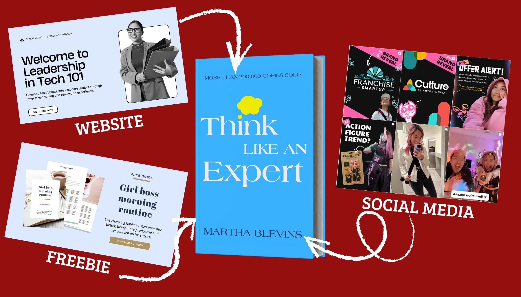
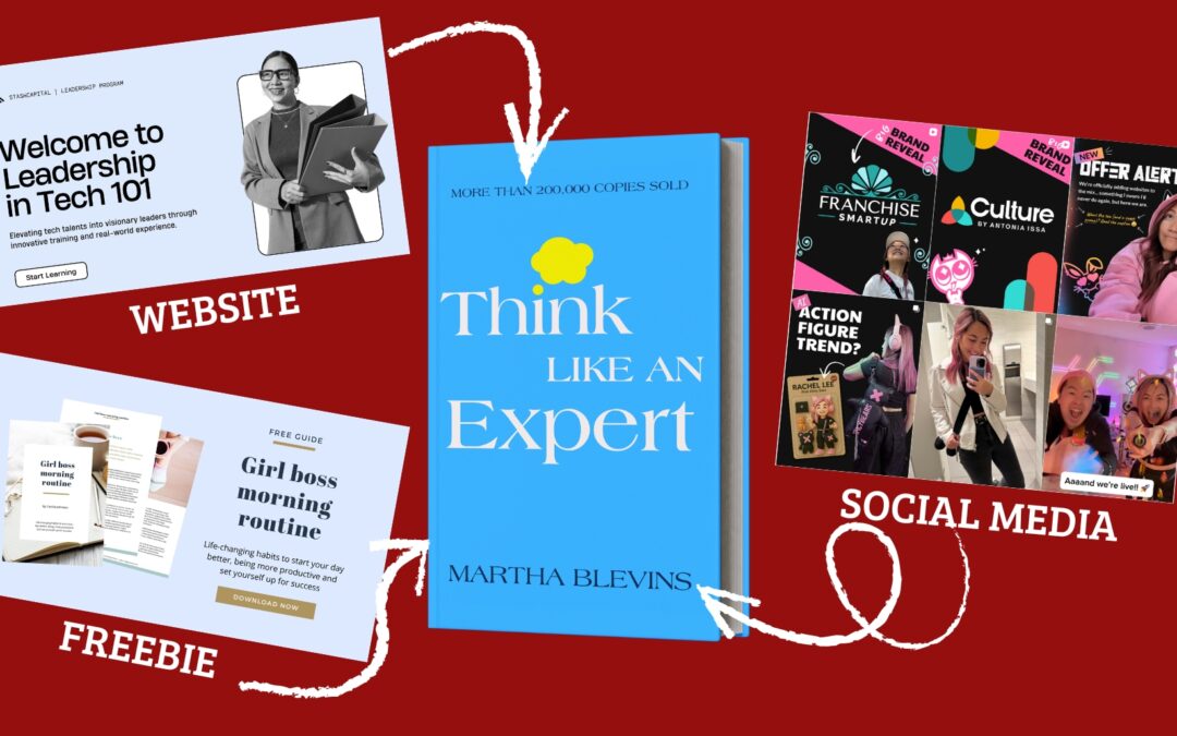
A website homepage, freebie sign-up and Instagram tiles all pointing to a hardcover book

Your platform exists to support your book and your broader work, not to become a separate full‑time job.

Make your book the hub
  1. On your site, your book has a dedicated page that everything else can link to.
  2. Your email opt‑in is tied to a concept from your book.
  3. Your outreach channel content regularly points back to the ideas and stories in the book.

This positioning helps readers understand that the book is the clearest, most complete version of your help for them.

Use your platform for launch and beyond

Before launch:

  • Share the journey: cover reveal, table of contents preview, snippets of the writing process.
  • Invite your email subscribers and followers to be early readers or launch supporters.

After launch:

  • Continue sharing stories of how readers are using the book.
  • Refer new opportunities (podcasts, speaking, clients) back to your existing platform and email list.
  • Start collecting ideas and feedback that might shape your next book or offer.

Part 5: Keeping It Sustainable

A woman wearing several hats, looking right at the camera with a confident gaze

You already have a full life. Your platform needs to respect that.

Set realistic, non‑negotiable minimums

Instead of aiming for “perfect,” choose a sustainable rhythm:

  • Update your primary channel once a week.
  • Email your list every 2–4 weeks.
  • Refresh your website only when there is a meaningful change (launch, new offer, major media mention).

These habits compound over time without consuming your entire schedule.

Batch and repurpose
  • Turn one strong idea from your book into: a short blog post, an email, and two social posts.
  • Pull quotes, frameworks, or questions directly from your manuscript.
  • Save templates for common content types so you are not starting from scratch each week.

Your book is not just a product; it is a rich source of ongoing content.

A Simple Checklist to Get Started

Use this as your quick “first platform” checklist:

  1. Defined a specific reader and one‑sentence promise for your book.
  2. Created a basic website with Home, Book, About, and Contact/Work With Me pages.
  3. Set up one email opt‑in that connects directly to your book’s main promise.
  4. Wrote a short welcome sequence that introduces you and gently points to the book.
  5. Chosen one primary outreach channel you can maintain weekly.
  6. Outlined 4–8 simple content ideas drawn directly from your book.

Once these pieces are in place, you have a real author platform: not flashy, not overwhelming, but strong enough to support the launch of your first nonfiction book and everything that comes after it.

Join

Donna Barker with a red pixie haircut smiling at the camera
Own Your Amazon Real Estate

Own Your Amazon Real Estate

Use A+ Content to Stop Losing Readers to Other People’s Books

A+ Content lets you turn your Amazon book page into a branded mini‑website that shows off your expertise, stops browsers from wandering, and boosts your conversions and credibility. Multiple Amazon partners and agencies report that Amazon’s own studies show A+ Content can increase conversions by 3–10%.

For non-fiction authors—especially women using their book to build authority—filling that space with strong visuals and clear messaging is one of the most powerful upgrades available.

What A+ Content Is

A+ Content is the visual section on your Amazon detail page that appears under “From the Publisher” and can include images, formatted text, and comparison tables. On KDP, you can add A+ Content to paperbacks and Kindle ebooks directly from your KDP dashboard.

Amazon lets you add up to five modules per page, chosen from templates like image‑with‑text, banners, and comparison charts. When activated, this section can sometimes replace and, if done well, will visually overshadow the standard product description, making your book stand out instantly.

Why Filling Page Real Estate Matters

Every Amazon book page includes multiple sections that promote other people’s titles, such as “Customers who bought this also bought” and sponsored products (the books authors are paying to put on your book’s page). If you do not fill your own real estate with A+ Content, your detail page quickly becomes a billboard advertising competing books right under your cover. It’s really annoying!

When you occupy more vertical space with your own visuals and messaging, you push those carousels further down and keep the reader’s attention on your book longer. That extra attention can translate into better understanding about your title, stronger trust, and more buyers choosing your book instead of clicking away to another author’s listing.

Plain text also makes it harder to highlight your strongest angles—like social proof, a clear promise, or who the book is for—because everything looks the same. In a crowded marketplace where shoppers compare multiple tabs at once, a bland block of text simply cannot compete with a clean, structured, and bolded competitor listing.

How to Create A+ Content in KDP

Creating great A+ Content starts with research. Look up books in your exact category, then broaden to bestsellers that speak to the same audience—even if they cover different topics—so you can study how they use images, headlines, and comparison charts to tell a clear story and build trust.

Pay attention to what instantly “clicks” for you as a reader: strong benefit‑driven headers, clean visuals, and modules that highlight outcomes, credibility, and what’s inside the book.

Use those elements as inspiration, not copy, to design your own set of branded modules that match your message and audience. If you notice that many comparable titles skip A+ Content entirely, take a moment to celebrate—you are already doing a better job protecting and owning your Amazon real estate than many traditional publishers and big‑name authors do.

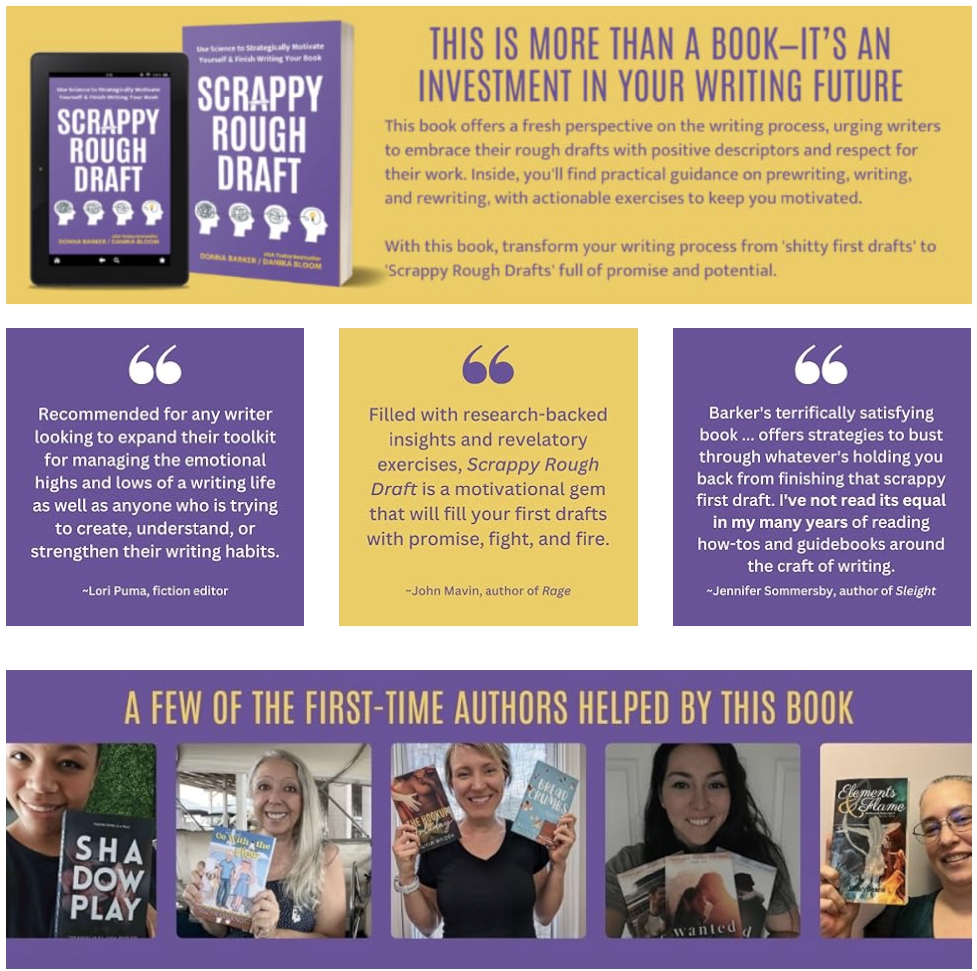
A+ for Scrappy Rough Draft includes more description, 3 reviews, images of authors helped by the book

The two modules used in this design are the Standard Company Logo (top and bottom) and Standard Three Images & Text (for the reviews) 

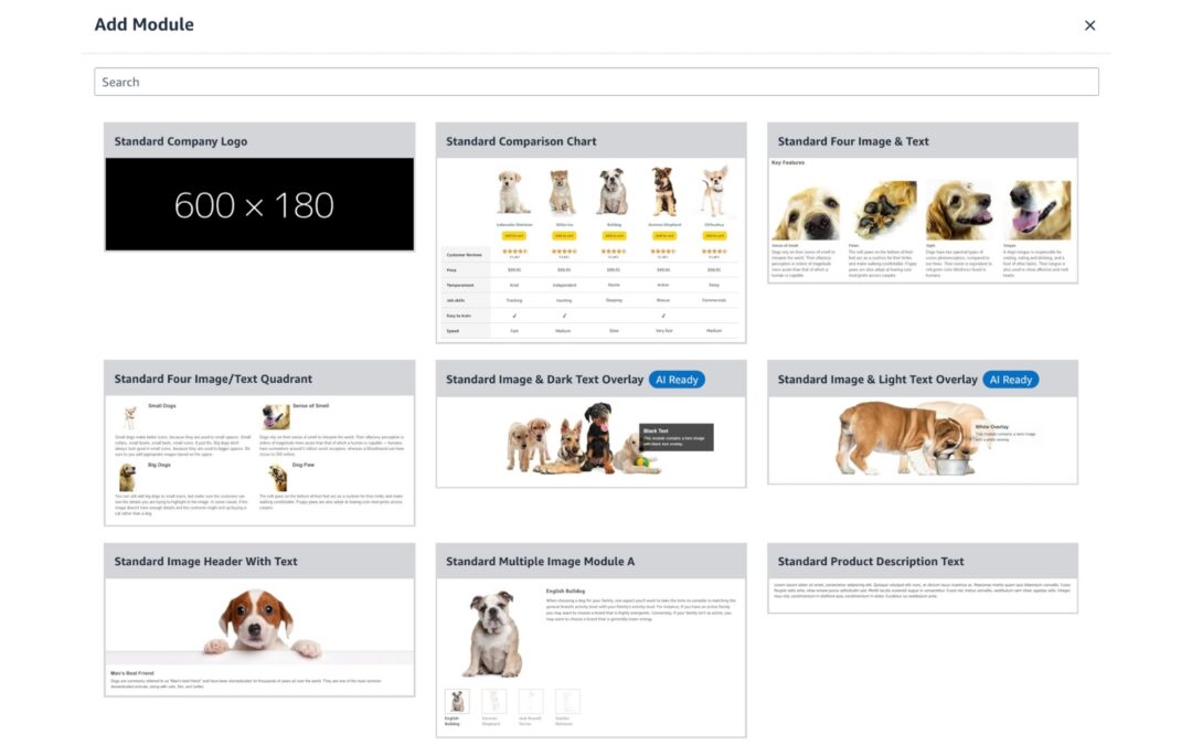
    There are seventeen different modules Amazon provides for you to make your own, but the most common for authors are:

    1. Standard Company Logo (used for any graphic that is 600px X 180px)
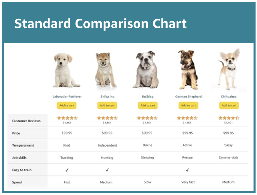
    2. Standard Comparison Chart (Most often used once an author has more than one book)
    3. Standard Image & Light Text Overlay (without actually using the overlay text)
    4. Standard Three Images & Text (often without the text)
    Amazon A+ Standard Comparison Chart

    What to Include in Nonfiction A+ Content

    For nonfiction authors, A+ Content should showcase your expertise, make the transformation crystal clear, and reduce risk for the reader. Here are a few good examples to inspire you.

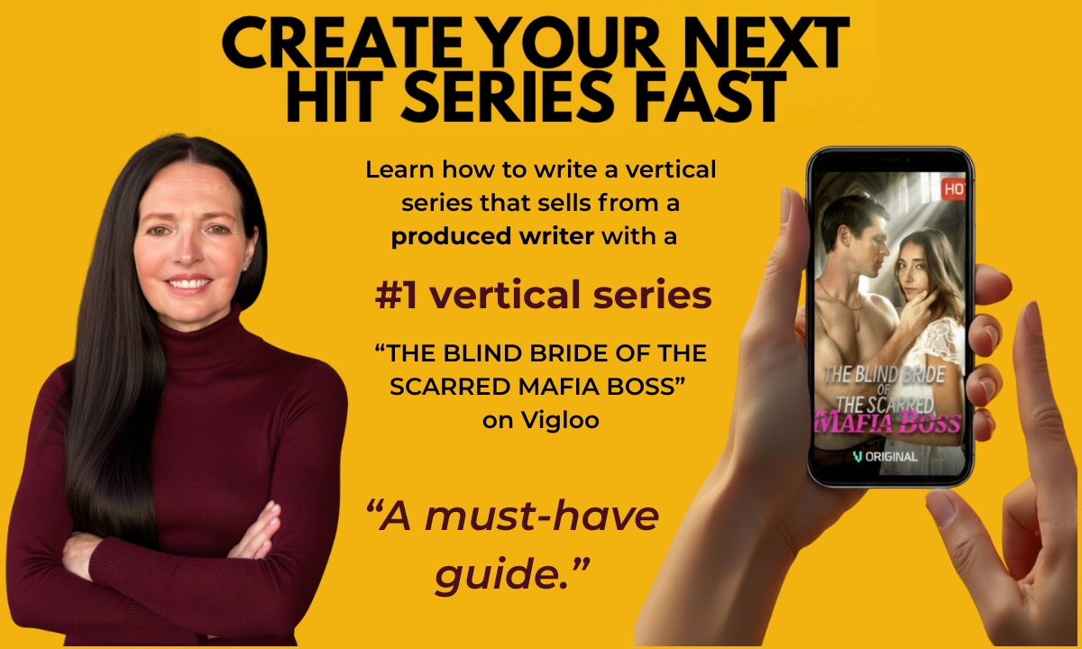
    Author smiling out, hand holding a phone showing a movie, author credibility statement
    Clear promise & author credibility

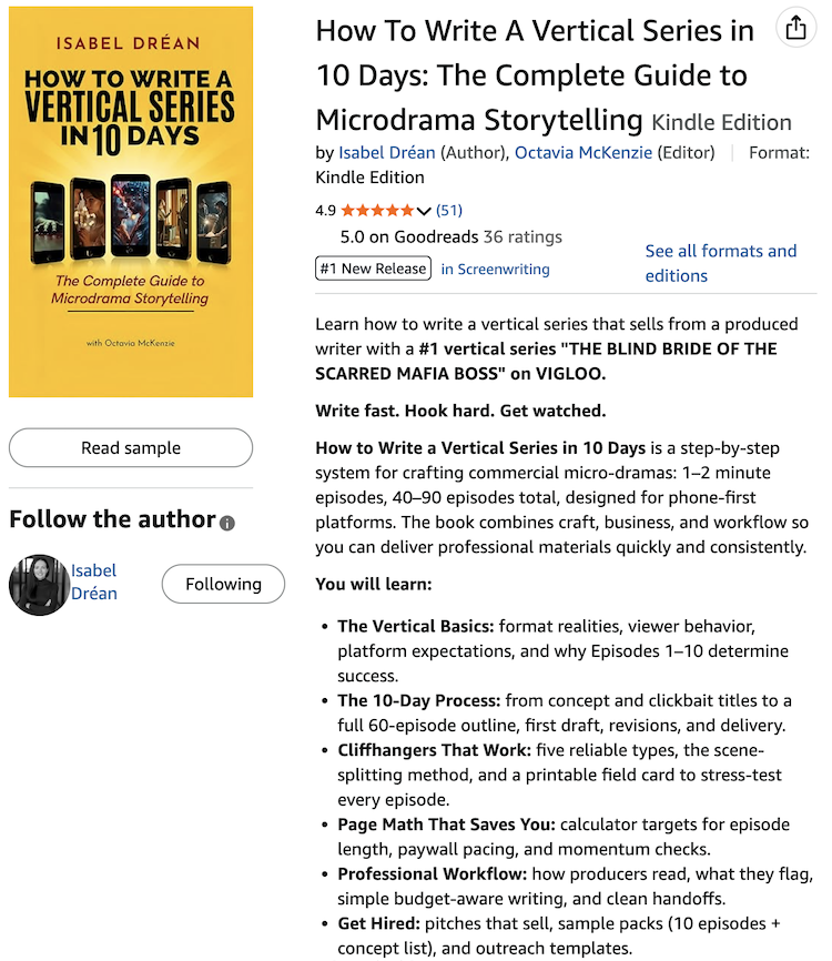
    Example from How to Write a Vertical Series in 10 Days by Isabel Dréan

    Uses the Standard Image & Light Text Overlay module sized at 2400px X 1440px

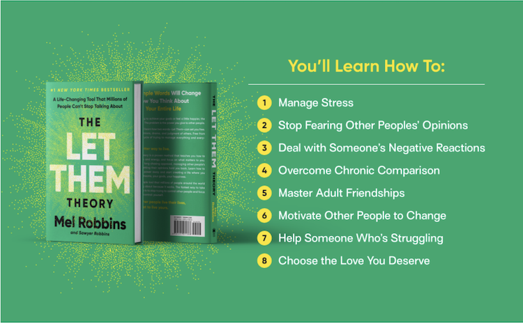
    Cover of Mel Robbins' The Let Them Theory with a list of bullets of benefits
    Benefits and outcomes

    Short bullets that translate features into results: save time, avoid mistakes, gain confidence, reach a specific goal.

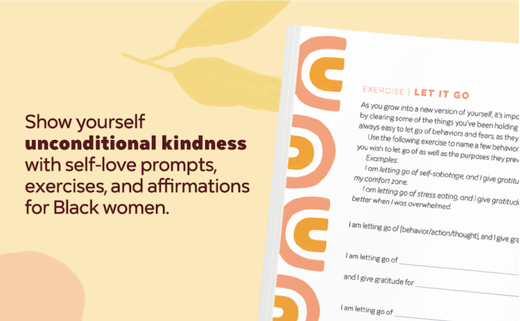
    A+ Look Inside Self-Love Journal for Black Women showing an exercise
    Inside look at the book

    Example from Self-Love Workbook for Black Women: Empowering Exercises to Build Self-Compassion and Nurture Your True Self by Rachel Johnson

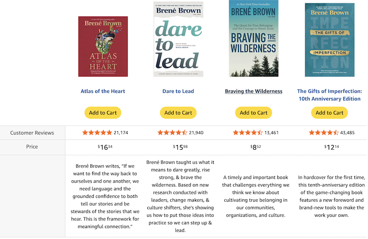
    A+ comparison chart for Brene Brown's books
    Cross‑promote your other books

    Example from Brené Brown’s Rising Strong: The Reckoning. The Rumble. The Revolution.

    Why A+ Content Boosts Sales

    A+ Content increases the perceived professionalism of your book page, which raises trust and reduces hesitation—especially important for nonfiction readers who want credible guidance. Many optimization experts report that A+ Content can improve conversion rates by giving shoppers more clarity, more proof, and more emotional connection than a standard description alone.

    Because A+ Content is visually rich and structured, it keeps readers on your page longer, which can indirectly support your performance in Amazon’s algorithms by improving engagement and conversion behavior over time. When that happens, your book is more likely to be shown for relevant searches instead of quietly slipping under the radar.

    Putting It All Together

    For a woman non-fiction author, your Amazon page is often the first serious impression a potential reader or client gets of your work. Using A+ Content to claim as much of that page as possible means: more control over your story, less distraction from competing books, and a stronger, more confident presence that matches the value of your expertise.

    Join

    Donna Barker with a red pixie haircut smiling at the camera

    Amazon Book Description Makeover

    Amazon Book Description Makeover

    Simple HTML Tweaks That Boost Sales

    A well-formatted Amazon book page can dramatically lift your clicks, conversions, and overall sales, and HTML formatting is one of the fastest wins most authors are still ignoring. Using Kindlepreneur’s Amazon Book Description Generator lets you get those professional HTML benefits—without needing to learn any code.

    Why Your Amazon Page Design Matters

    Your product detail page is the “salesperson” for your book: when it looks polished and easy to scan, shoppers trust you more and buy more often. Optimization experts consistently find that detailed, visually clear pages increase both visibility in Amazon search and conversion rates once shoppers land on the page.

    On Amazon, even small conversion improvements compound: higher conversion can lead to better rankings, which brings more traffic and even more sales over time. Many product pages convert in the 10–15% range once optimized, so leaving your description as a wall of text means walking away from real, measurable revenue.

    The Problem With Plain Text Descriptions

    Look at the Rich Dad, Poor Dad description as an example: it’s long, dense, and visually uninviting, with very little scannable structure.

    Readers landing on a page like that must work to find the key benefits, which increases bounce rates and weakens the emotional pull to buy. *

    * I realize Rich Dad, Poor Dad has sold millions of copies. But it was published in 1997 and the sales page today looks amateurish. You can do better!  

    Plain text also makes it harder to highlight your strongest angles—like social proof, a clear promise, or who the book is for—because everything looks the same. In a crowded marketplace where shoppers compare multiple tabs at once, a bland block of text simply cannot compete with a clean, structured, and bolded competitor listing.

    Screenshot of Rich Dad, Poor Dad's Amazon sales page

    Plain text also makes it harder to highlight your strongest angles—like social proof, a clear promise, or who the book is for—because everything looks the same. In a crowded marketplace where shoppers compare multiple tabs at once, a bland block of text simply cannot compete with a clean, structured, and bolded competitor listing.

    Screenshot of a well-formatted Amazon blurb

    How HTML Formatting Can Improve Sales

    Amazon allows a limited, but powerful, set of HTML tags—such as bold, italics, line breaks, subhead-style text, and lists—to transform a flat description into a skimmable sales message. Used well, HTML lets you break your copy into short paragraphs, emphasize key phrases, and create bullet lists that answer objections and spotlight benefits.

    These layout improvements directly support conversion best practices: clear hierarchy, strong callouts, and easy scanning so shoppers can decide quickly.

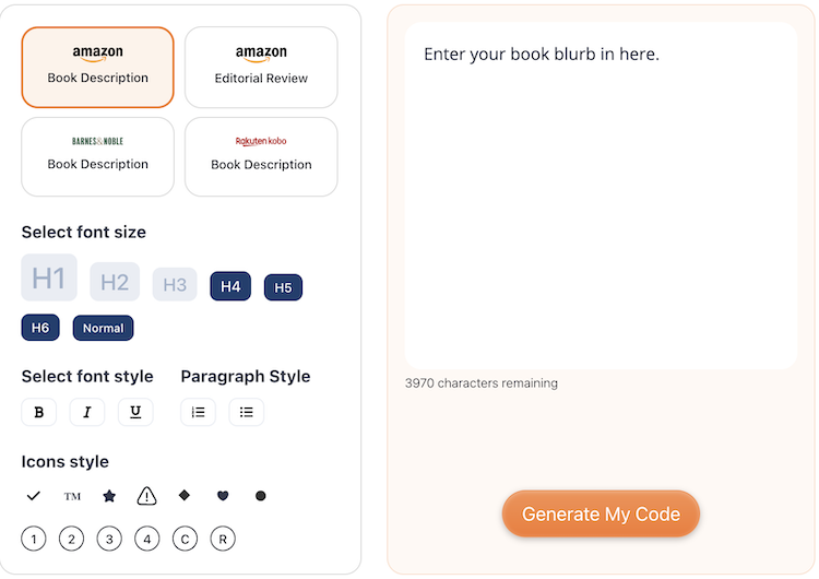
    Kindlepreneur’s Amazon Book Description Generator is built specifically around Amazon’s current HTML rules, so you stay within the approved tags and avoid code that will be stripped or break your layout. The tool lets you format with buttons—bold, italics, headings, and lists—and then automatically produces clean HTML you can paste into your KDP dashboard.

    The latest version also includes an AI option that can help refine your blurb for clarity, genre expectations, and emotional pull before you generate the HTML. This means you get both stronger copy and professional formatting in one workflow, without needing to touch raw code or memorize Amazon’s ever-changing formatting rules

    Screenshot of the Kindlepreneur book description formatter

    SEO, AIO, and the Bigger Strategy

    From an SEO and “AIO” (AI-optimized) perspective, a well-structured description makes it easier to incorporate relevant keywords in natural, reader-friendly ways. Amazon and external search engines both reward pages where keywords appear in meaningful, organized content instead of keyword-stuffed clutter.

    At the same time, the AI-enhanced workflow in Kindlepreneur’s tool helps ensure your copy stays readable, persuasive, and aligned with what real shoppers want, not just what algorithms prefer. This balance of human-friendly persuasion and algorithm-friendly structure is exactly what drives more impressions, more clicks, and more sales over time.

    Where A+ Content Fits In

    HTML formatting in your main description is the foundation; A+ Content is the next layer of visual storytelling and brand building. For Brand Registered authors, A+ modules—images, comparison charts, and rich media—can further increase conversion rates beyond what a text description alone can do.

    Because A+ Content deserves its own strategy, layout, and examples, I’ve written a separate, dedicated blog post that builds on this one to create a high-converting Amazon sales page.

    Join

    Donna Barker with a red pixie haircut smiling at the camera